
This article may contain affiliate links. Clicking on or purchasing products we recommend through a link may earn a small commission. Read our disclosure and privacy policy page for details. *COVID-19 TRAVEL ALERT – Travel recommendations offered on this site are not to encourage you to travel against travel advisories.
As the owner of numerous websites and an avid blogger, I know that hiring a designer to create your personal blog’s look and feel or to enhance posts on your business website, may not be feasible when you have no budget! So how to make your blog stand out from the rest?
Dream it.
I already know what your dream is. You want to know how to make your blog profitable. Having a successful blog means building your blog’s readership, and the best way to stand out from all the other blogs out there is to make your blog more attractive than the rest.
Your blog’s content is crucial, however many of you ask me why is this not working? How can I make my blog more interesting? How can I get my blog noticed? I’m going to assume you are working on the quality content portion of the formula, and in this post, I want to talk about your blog’s brand or visual identity.
Read More: How to Create a Brand Board for Your Blog or Business + Free Template
Plan it.
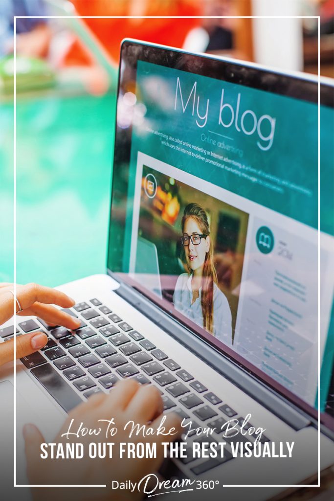
How to Make Your Blog Stand Out from the Rest
Blogs can be part of your business’ website or a personal blog website made up of posts. It doesn’t matter what type of blogger you are, the formula for success is
- Quality Content
- A Website’s Brand and Reputation
- Technical Operation (Site Speed, Navigation, Security)
So let’s talk about your brand and your website’s look and feel.
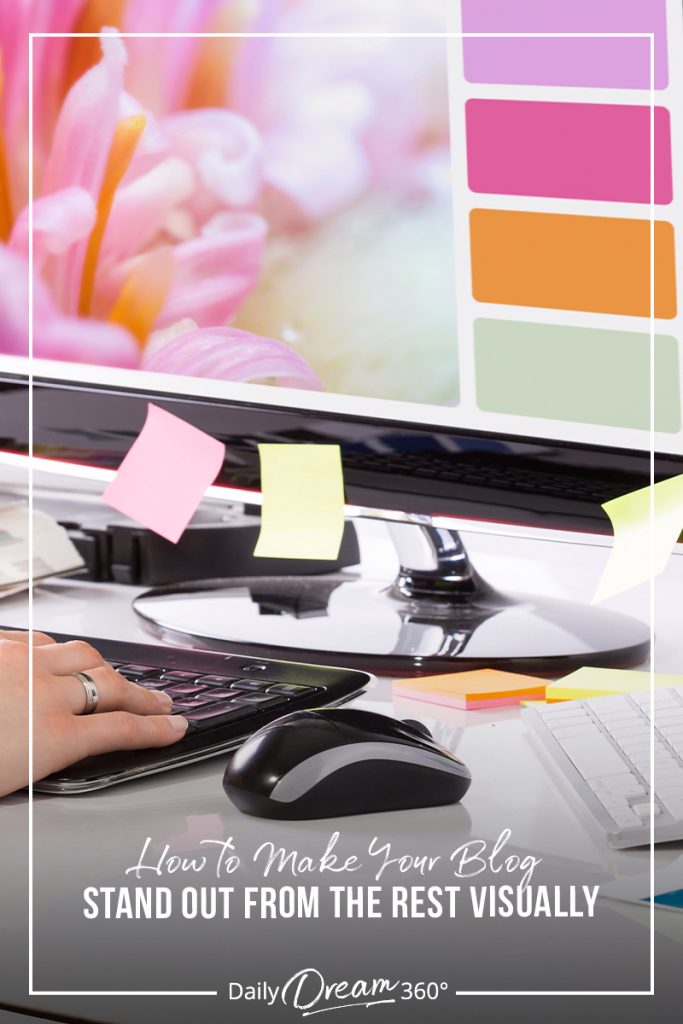
Have a Consistent Design and Build Your Brand
When I say be consistent, I am not talking about how many posts you can cram into a week. I’m talking about visual design consistency. Choose your colours (usually to compliment the ones in your logo), choose your fonts (1-2 max) and then use them everywhere.
If you look at the websites you admire, what do you like about the? The thing about the look, how you navigate around, what draws you to keep searching through the site?
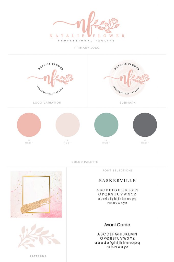
Develop a Visual Brand Identity for Your Blog
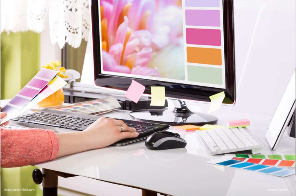
Blog Design and Logo Colours
You don’t have to be Picasso here. Start with the primary colour in your logo and choose a complimentary colour or two for shading or headlines. Most good logo designs have a logo with 1 or 2 colours. Online we can get away with a multi-colour or four colour logo. Think about the type of business you want to be – a professional-looking one or someone that found clipart they like with a million colours.
That doesn’t mean you can’t use a beautiful photo in the header of your site, but your logo and personal brand should be distinct, and you set up some rules about which colours appear as headings, buttons etc.
Website and Brand Fonts
Be consistent with the use of your fonts. Choose a clean, bold font for headings and an easy to read font for body text. Stick with web-friendly fonts that are easy to read and not too fancy.
It also helps if these fonts are accessible in the tools you use to create graphics for your site. If you are using online branding tools like Canva, you’ll want to use the fonts on your website to create a streamlined visual look and feel.
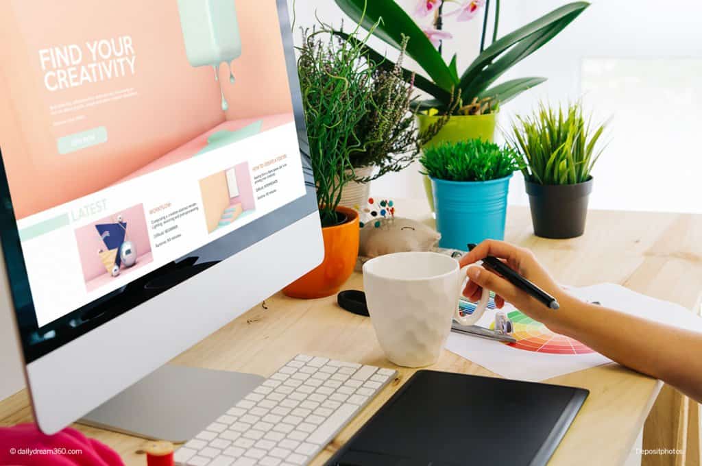
Your Website’s Photos and Imagery
I can’t tell you how many times I’ve visited a blog and clicked on their twitter link to see an entirely different look and feel on their Twitter profile. For a second, I think – oh, this is the wrong link?
Your website’s branding should extend to Twitter, Facebook and LinkedIn company page profiles. Make sure you use the right sizing for each social channel, so you have a professional look across all profiles. Your header images, profile photo/logo, should be consistent.
You should regularly use the same colours, font formats, thumbnails, image sizes throughout your blog and social media pages – your readers will become accustomed to your style and respond to it better.
Keep Things Clean and Simple
Simple is ALWAYS better! If you put too much art on a page, it can look like graphic barf. I know that sounds harsh, but I see it all the time – 10 different fonts, pictures scattered everywhere, squiggly designs all on one social media graphic!
Applying every design technique you see at once is overwhelming, busy, and while you think it may be funky, ask yourself – is it helping your blog?
Using a different Canva technique on each image you share with your audience is only going to confuse them and show you have no particular blog brand! So pick fonts and styles you like and stick with them!
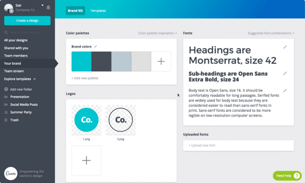
Create a Blog Brand Board
As a designer, I’ve said this 1000 times, so I will repeat it – the best graphic design tips for bloggers to remember:
- Choose 1-2 fonts maximum per website
- Pick a colour scheme of complementary colours
- Use good photos and images
Don’t know where to start. Create a mood board with images you like that you want to define your blog by. Create a collage of these images and see if there are any colours that stand out.
Test drive Canva Pro where you can create an easy to use Brand Board using their design tools and templates you’ll produce your own custom brand easily in no time.
Read More: How to Start a Successful Blog While Working Full Time
Live it.
Use Interesting Headlines and Break Up Content on Pages and Posts
There are many ways to break up the content on your page. Keep sentences short and follow some of these suggestions to help break up the text and make your posts easier to read.
Use headings and subheadings:
A title can break up a long post and call out information that may keep your reader from closing the page before they read the post! That said – don’t overdo it. A main heading and sub-heading style is probably enough. You rarely won’t need more than four levels of different heading styles on a blog post! Break up your content naturally using headings. Don’t overdo it!
Use Photos: This is apparent in people like visual graphics on blogs. So great photos, either stock photography or photos you’ve taken yourself is visually more appealing for your readers.
There are many ways to break up the content on your page to make you look better and to make your posts easier to read.
Use Call Outs or Lists:
- Bulleted lists break up the post making it simpler to read.
- Twenty paragraphs of text can be overwhelming for someone looking for a quick answer!
- Have natural graphic breaks in your post using images or graphics.
- Look more professional
Social Media Marketing and the Importance of Pinterest
I will share some more useful Pinterest strategies for blogs in a future post. Still, almost all bloggers that struggle with getting their blog seen at the beginning have told me they haven’t implemented Pinterest into their marketing strategies. If you are relying only on Google Search, then you are missing the next most prominent search engine – that’s right, Pinterest.
You may think this is more work for me as I have to create specific vertical images for Pinterest and 3-5 just pin images per post on your site can seem like a daunting task to add to your already full list of things to do, but Pinterest can help your blog get seen.
Sharing your posts on Facebook, Twitter and Pinterest are my usual recommendations for most bloggers depending on their niche. I will share some marketing strategies for website blogs in a future post.
That’s my design lecture for today! A few easy things to remember when working on your blog to make it stand out from the rest of the pack!
Great post. I also implemented the above steps in my blog My Blind Bird Do check it out.
Glad you found it useful.
ummm this is such an awesome post! I definitely need to work on your point of developing a visual brand identity. Will be referring back to this. Thank you!